spralnica.si, published website
Spralnica is a space for Črt Kranjc's poetry. The design should support the writing, so the web experience is built around rhythm, contrast and room to read.
What you can inspect yourself
The portfolio describes only published or publicly visible elements. You can inspect the result on the live domain.
- A layout led by typography
- Published writing
- A calm, readable structure
- Fast loading without unnecessary elements
Project scope
- Content planning
- Typography and reading UX
- Responsive development
- Publication
When writing is the main interface
A conventional business homepage with lengthy explanations, icons and sales cards would not serve poetry. Visitors need a title, an author and a quiet way into the writing. The information architecture is therefore deliberately brief and organised around the published work.
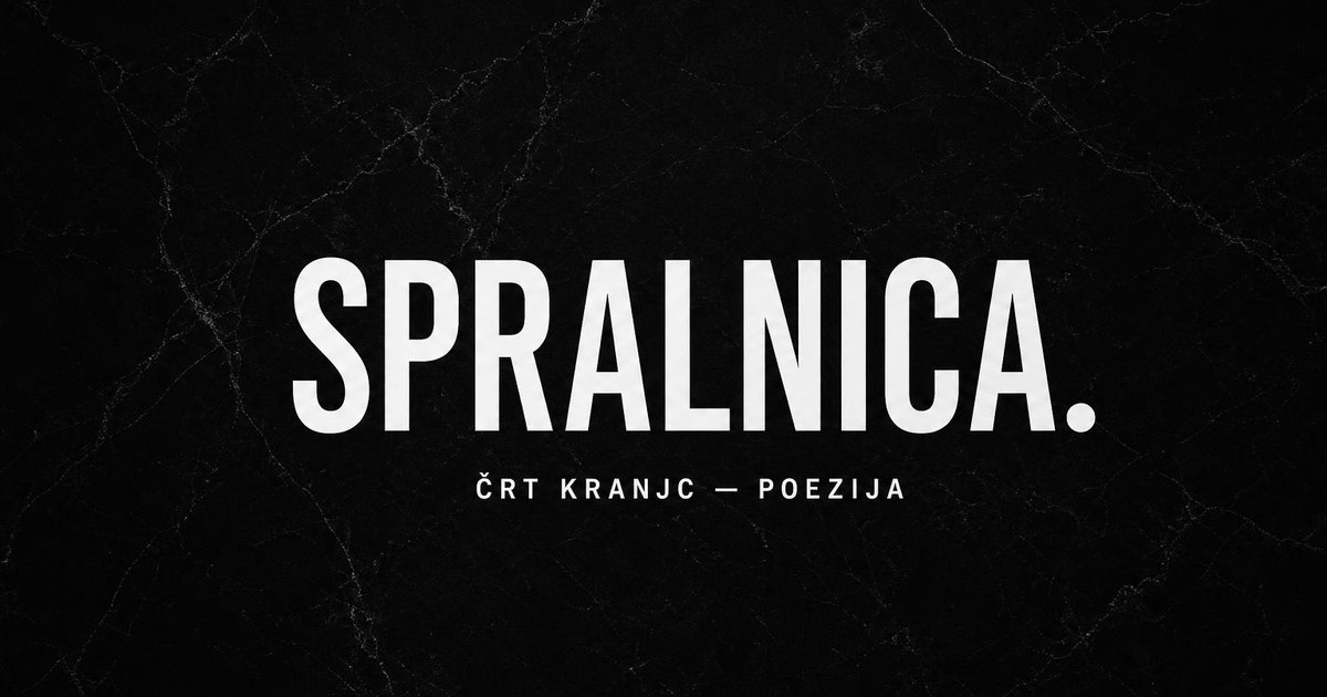
The project uses typography as visual material. A large heading establishes the identity, while smaller text sets the reading rhythm. The dark background and restrained colour palette reduce visual noise and help the eye settle on the language rather than the decoration around it.
Rhythm across different screens
A page centred on writing is sensitive to line length, line spacing and heading size. On larger screens, the layout avoids stretching poems across the full width; on phones, it preserves enough space to keep individual passages from becoming a wall of text.
Navigation stays short and predictable. Readers can focus on one piece, return to the overview or continue to the next without being sent through unrelated components. The interface is simple but distinctive: every decision supports the same reading experience.
What visitors can verify
The live site demonstrates the typographic hierarchy, the relationship between headings and content, and the responsive reading experience. The portfolio includes only public design and technical features, with no claims about private visitor or reader data.